

Bitcoin and Ethereum don’t just move in price — they breathe on-chain. If you know how to listen to that “breath”, you can often spot turning points before the candles on TradingView even start blinking red or green. Let’s break down how tracking flows between BTC and ETH can hint at reversals, rotations and even macro shifts in crypto risk appetite.
—
Why on-chain flows matter more than ever
Prices can be faked for a while with wash trading, thin order books or aggressive market makers. On-chain flows are harder to fake at scale. When large amounts of BTC or ETH move from cold wallets to exchanges, or from exchanges to self-custody, it usually reflects real decisions: someone is preparing to sell, to accumulate, to stake, to lever up, or to exit risk.
Short version: capital on-chain is like water in a system of pipes. The direction and speed of that flow between Bitcoin and Ethereum often reveal where the market wants to go next.
—
Key divergence idea: “Risk-on ETH, risk-off BTC” – but not always
Most of the time, ETH behaves like “leveraged beta” on BTC: when the market turns risk-on, ETH tends to outperform; when things get scary, Bitcoin outperforms as a relative safe haven. But the interesting part is not when they move together — it’s when bitcoin vs ethereum on chain analysis shows their flows totally disagreeing.
Example:
If BTC is pouring into exchanges (potential sell pressure) while ETH is draining from exchanges into staking and DeFi, that’s a mixed signal:
– One side of the market is getting defensive (BTC holders preparing to sell or rebalance).
– The other side is getting long-duration, yield-seeking, “I’m staying here for a while” (ETH stakers and DeFi users).
That divergence often precedes either a short-term shakeout or a regime change in which one asset becomes structurally more attractive than the other.
—
Concrete stats to watch: not just prices, but pipes
To make it less abstract, here are data points from recent cycles (numbers rounded, trends more important than exact decimals):
1. Exchange balances
– Bitcoin: centralized exchange BTC balances have dropped roughly 25–35% from the 2020 peak to 2024, signaling long-term accumulation and self-custody.
– Ethereum: exchange balances also fell, but a notable share of ETH moved not just to cold wallets, but to staking contracts and DeFi protocols.
A big spike in BTC flowing *back* to exchanges after a long decline has historically lined up with local tops or at least with volatility bursts.
2. Staking and locked supply (ETH only, but crucial for flows)
By late 2024, over 25% of total ETH supply has been locked in staking. When that share is rising while ETH exchange balances shrink, the liquid float collapses, making it easier for spot demand to trigger outsized moves.
3. Stablecoin flows around BTC and ETH
During the 2021 top, stablecoin inflows to exchanges peaked alongside BTC. In later mini-cycles, stablecoins rotated increasingly into Ethereum DeFi and L2s, even while BTC spot inflows slowed. That decoupling has signaled rotation from “macro BTC” to “on-chain ETH economy”.
When these metrics diverge between BTC and ETH instead of moving in sync, that’s where the turning points usually start.
—
Forecast: how these divergences might look in the next cycle
If we look forward 2–3 years, there are a few plausible scenarios where divergences get even louder:
1. Scenario: BTC as macro collateral, ETH as yield engine
– BTC: increased institutional adoption, use as long-term reserve collateral, more wrapped BTC in RWA/ETF-like structures. On-chain flows shift from exchanges to large custodians and L2 bridges.
– ETH: continued growth of staking, restaking, L2s, and DeFi. Large ETH flows rotate between staking, liquid staking tokens (LSTs), and protocols, not so much in and out of CEXs.
In this world, a turning point might look like:
BTC custodial inflows slow sharply while ETH staking deposits flatten and DeFi stablecoin activity spikes. That could hint at a macro risk-off shift (institutions pause BTC buys), while crypto-native capital chases last bursts of yield in DeFi — historically a late-cycle behavior.
2. Scenario: regulatory shock vs. on-chain resilience
Let’s say regulations hit centralized exchanges or staking services in a big market.
– BTC might see temporary spikes in exchange outflows (people rushing to self-custody), followed by thin liquidity and abrupt price gaps.
– ETH might see migration of staking from regulated providers to decentralized protocols, with big on-chain flows but not necessarily price collapse.
Here, divergence in on-chain paths (BTC fleeing CEXs vs. ETH reshuffling within protocols) would signal not just a price turning point, but a structural industry reshuffle.
—
Economic lens: what BTC vs ETH flows really say about risk
Think of Bitcoin flows as a gauge of *macro risk appetite* and *store-of-value demand*. When BTC leaves exchanges and sits idle in deep cold storage, that’s essentially a long-term inflation hedge position — people aren’t looking for yield, they want scarce collateral.
Ethereum flows, especially post-merge, tell you more about *crypto-native economic activity*:
– staking = demand for yield and belief in the network’s longevity;
– DeFi usage = demand for leverage, credit, and speculation;
– L2 bridging = expectation of higher throughput and more users.
So, when BTC flows show hoarding while ETH flows show high rotation in DeFi and L2s, the economic picture is:
“Macro is cautious, but crypto natives are still gambling.”
That’s the sort of late-stage bull behavior that often ends with a sharp correction.
Reverse case:
If BTC flows show accumulation but ETH flows stagnate or even see outflows from DeFi and staking back to stablecoins, you’re closer to an early bull phase where capital is still shell-shocked and hasn’t yet chased yield.
—
What actually signals a turning point: three core divergences
Here’s a simple framework you can adapt, even if you don’t build your own crypto on chain analytics software.
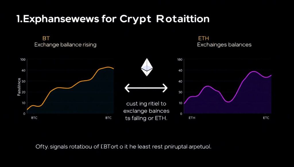
1. Exchange balances diverge
– BTC exchange balances rising
– ETH exchange balances falling or flat
→ Often signals rotation *out of BTC into ETH* or at least greater speculative appetite for ETH. Can precede periods where ETH/BTC pair turns up.
2. Whale flows disagree
– Large BTC wallets sending to CEXs, while large ETH wallets send to staking or DeFi.
– Or vice versa: whales hoard BTC in cold storage while unlocking ETH staking or exiting DeFi.
→ This has historically foreshadowed medium-term rotations between “digital gold” narratives and “on-chain economy” narratives.
3. On-chain velocity vs. HODLing
– BTC: velocity (coins moved per day vs. supply) drops while long-term holder supply rises.
– ETH: velocity and gas usage spike, especially in periods of high NFT, DeFi or L2 activity.
→ When ETH velocity spikes but price lags, it may be a leading indicator of coming upside; when velocity collapses while price is still high, it smells like exhaustion.
—
Unconventional twist: build your own “flow ratio” indicators
Instead of staring at 20 dashboards, consider compressing BTC and ETH flows into a couple of DIY ratios. You don’t need to be a quant; a spreadsheet is enough.
1. Exchange Flow Ratio (EFR)
– EFR = (BTC net exchange inflow % of supply) / (ETH net exchange inflow % of supply)
If EFR spikes above its 6–12 month average, BTC is sending more supply to exchanges relative to ETH. Historically, such spikes have lined up with periods where ETH/BTC outperforms down the line.
2. Illiquid Supply Shift (ISS)
– ISS = (Change in illiquid BTC supply) – (ETH staked + LST growth, normalized)
When ISS is strongly positive, BTC is hoarded faster than ETH is being locked or staked. That’s a “BTC is becoming more pristine collateral” signal. Extended positive ISS with low volatility often precedes a big macro BTC move.
3. Yield vs. Hoard Index (YHI)
– YHI = (ETH DeFi + staking flows) / (BTC cold storage growth)
High YHI = market prioritizes yield and on-chain activity. Low YHI = market hides in hard collateral. Extreme values of YHI, followed by reversals, can flag cycle inflection points.
You can pipe base data from any on chain data analytics platform for bitcoin and ethereum, then compute these simple ratios on your own. That’s already more nuanced than staring at price charts alone.
—
Nonstandard solution: use flows as *risk budget*, not just trade signals
Most traders treat on-chain data like another indicator to time entries. That’s leaving value on the table. A more robust (and unusual) approach is to use BTC vs ETH flows to dynamically adjust:
– how much leverage you allow yourself;
– how much altcoin exposure you take;
– how much you leave parked in stablecoins or BTC.
Think of BTC and ETH flows as your *risk thermostat*:
1. If BTC is moving off exchanges into long-term holdings while ETH is heavily staked and DeFi usage is moderate but rising →
You’re likely early/mid-cycle. Increase risk budget moderately, allow more alt exposure.
2. If BTC is rushing to exchanges while ETH activity goes parabolic across NFTs, memecoins, and “degen” DeFi →
That’s euphoria plus hidden distribution. Decrease leverage, take profit on illiquid alts, move some stack back to BTC or stablecoins.
3. If both BTC and ETH see muted flows, volumes are low, and volatility is crushed →
Accumulation or apathy. Here, systematically DCA into your preferred asset mix, but don’t chase short-term trades.
This approach doesn’t try to perfectly time tops/bottoms. It uses on-chain as a throttle on how aggressive you allow yourself to be.
—
Tools of the trade: going beyond basic dashboards
Most people just open a popular bitcoin ethereum flow tracking tool and stop there. That’s like only using moving averages in a world full of options. Instead, combine tools like this:
1. A broad crypto on chain analytics software suite for raw metrics (exchange flows, holder cohorts, realized prices).
2. An on chain data analytics platform for bitcoin and ethereum that lets you download CSVs or query via API.
3. A simple custom setup (Python notebook, spreadsheet, or low-code BI tool) to build your own ratios like EFR, ISS, and YHI.
Do not underestimate how much edge you gain from recombining public data in your own way. The alpha is less in having *secret* data and more in asking better questions:
“Is BTC becoming more like a bond and ETH more like a stock?”
“Are we in a phase where on-chain economic activity matters more than macro headlines?”
—
Best metrics to start with (and how to avoid noise)
If you’re overwhelmed, start with a short, focused set of the best on chain metrics for bitcoin and ethereum trading and layer complexity later.
1. BTC & ETH net exchange flows (7–30 day moving averages)
2. BTC long-term holder supply vs. short-term holder supply
3. ETH staking inflows and unstaking events
4. ETH gas usage broken down by category (DeFi, NFTs, L2, MEV, etc.)
5. Whales: number of addresses holding over X BTC or Y ETH and their net flows
Then:
1. Put these into a simple dashboard.
2. Tag major market events (ETF approvals, regulatory news, protocol upgrades) on the timeline.
3. Look for patterns where flow divergences preceded big price or narrative shifts.
Over time you’ll build an intuitive feel:
“When I see *this* BTC behavior together with *that* ETH behavior, we’re usually 1–3 months away from a big move.”
—
Industry impact: flows as the new macro dashboard
As more serious money enters crypto, on-chain flow analysis is quietly becoming the equivalent of bond market signals in TradFi. Traders, funds and even some corporates already watch whether BTC flows are dominated by long-term holders or short-term speculators.
For Ethereum, flows increasingly track the health of an entire digital economy:
– Stablecoin velocity and ETH burned give clues about payments and user demand.
– Staking and restaking flows influence protocol security and real-yield products.
– L2 bridging flows forecast where applications and liquidity might migrate next.
When large BTC and ETH flows start to diverge sharply, it’s not just a “trade setup” — it can mean:
– Mining and validator economics are about to shift.
– Protocol and L2 fee markets are entering a new phase.
– Exchanges and custodians will reprice their risk and liquidity models.
In other words, the plumbing of the industry is reconfiguring itself, and the charts are just the surface ripple.
—
Bringing it together: treating flows like climate, not weather
One last unconventional suggestion:
Stop thinking of on-chain flows as intraday signals and start treating them as *climate data*. Weather is the 5-minute candle; climate is the 90-day shift in BTC hoarding vs. ETH yield chasing.
If you regularly:
1. Track BTC and ETH exchange flows, staking/hoarding, and DeFi/layer-2 activity,
2. Convert them into a handful of intuitive ratios,
3. Use those ratios to size your risk rather than make all-or-nothing bets,
you’ll likely spot market turning points earlier and, more importantly, survive the ones you misread.
The chain is always talking. Market tops and bottoms don’t appear out of nowhere — they’re usually preceded by months of strange, asymmetric BTC and ETH flows. Learn to read those divergences, and you’re no longer just trading price; you’re trading the behavior of everyone plugged into the network.